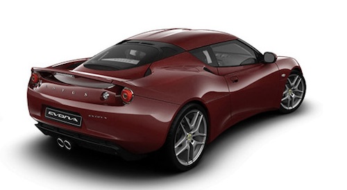
Of course the car that I drive is not in this class, I do like the color and would consider buying a Chevy or Ford in this color.

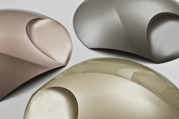
What are the trending color? Looking at the color trend reports for 2013 it becomes crystal clear to me that sustainability working hard for acceptance by the broader public. Natural colors are exploding in 2013! The best examples can be found in the colors for the automotive industry. After a revival of the color white it is now time for earthy colors like amber, brown and variations of ‘luxury green’ in European car design according to trend watchers of BASF Coatings’ international design team. They point out that luxury and sustainability are no longer strangers but go together well. In Germany already 12% of
new cars are brown? Interesting to say the least. Brown is Neutral and a Natural color.

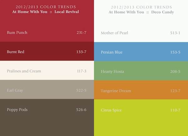
Also in the home decorating colors we will see a lot of browns and greens in 2012 and 2013, next to several bright colors like yellow and red. This mixture of pleasure and nature is intriguing. PPG Industry has made some nice color palettes illustrating how these colors match.

The colors on the left are in the natural/neutral whereas the colors on the right are natural/accent.
It's not just about colors in 2013. "Earthy textures lay a new foundation for palettes of blues and greens," I suggest breathing new life into an existing room with several coats of ocean-blue paint.

Thisl
gray room punctuated by one wall of deep, dark blue-green creates a
sensuous atmosphere in the master bedroom. This sleek scheme takes a cue
from Pantone's glamour palette of moody shades of gray and hints of
metallic shimmer. We suggest introducing rich red or cobalt blue accents
to add a bit of classic drama. It is dramatic and look at all of the
colors that are very subtle in use.

This
should give you further food for thought. As the year progresses we
will be looking for the introduction of more Neutral and Natural Colors.
KEN
RADER INTERIORS L.L.C. IS PROUD TO OFFER THIS INFORMATION. WE OFFER
ARTICLES ABOUT PAINTING AND DECORATING FOR YOUR EDUCATION AND ENJOYMENT.
WE ARE PROFESSIONAL PAINTERS AND DECORATORS IN FAYETTEVILLE ARKANSAS.
WE OFFER PAINTING AND DECORATING SERVICES THROUGHOUT NORTHWEST ARKANSAS.
FOR ALL OF YOUR PAINTING NEEDS CALL US AT (479) 443-3686
EMAIL US AT kennethrader@att.net and be sure and visit our web page at http://www.kenraderinteriors.com
AS ALWAYS “HAPPY PAINTING AND DECORATING!”

No comments:
Post a Comment
Constructive comments always welcome