Showing posts with label Bedroom Decorating. Show all posts

Wednesday, March 6, 2013

New Looks for spring in the Bedroom

Click on the Banner and visit our web site.


Spring is finally here and it is time to freshen up your home.

By: Ken Rader and Cathie Rader- Painters and Decorators in Northwest Arkansas

First up

The Bedroom

Turn your bedroom into a haven for relaxation with some fresh bedroom decorating tips. From master bedrooms to small bedrooms, see what is happening and get inspired by these bedroom photos and design ideas. Learn how to pull together all the elements that make a beautiful and fresh  bedroom -- from the paint color, to the furniture, to the bedding. Plus, learn more about bedroom lighting, including chandeliers, as well as bedroom flooring, bedroom curtains, and headboards. Learn how accessories, such as lamps, wall art, and throw pillows can work together with different furniture pieces to create a beautiful room. Whether your bedroom style is cottage, nautical, country, or modern, you'll find fresh decor ideas. Playful, functional, and filled with color. Get some of the best ideas for decorating both boy's bedrooms and girl's bedrooms, as well as teen bedrooms. We know that  DIY is your thing, These fabulous transformations take basic, bland bedrooms and revive them as gorgeous rooms filled with your personality, style, and comfort. Organization is also key to a beautiful bedroom.  So enjoy the pictures and guidance.
  Simplicity is King this spring.  Neutral colors paired with dark stained wood is all the rage.
  Accenting with bright colors is taking center stage.  Bright green came on strong this year and looks to continue to be a favorite.
  Very simple, neutral walls, green accents and basic furniture.  Yellow and Gold colors complete this fresh look.
  In this bedroom the bed is the focal point.  Once again, neutral color on the walls.  Notice the introduction of Gray.  Gray is a leader in color choices this year.  Not overdone but just enough to accent.
  For Girls bedrooms, Pink is the top choice.  It is coupled with another strong color "Gold".  See the green lamp shade?
  Brown and Gray combinations with the dark wood furniture will be very popular.  Throw pillows are making a comeback.
  This is not our favorite but many are leaning towards the cool appearance.  Light gray, blue and whites with a touch of black.
  Tan, Brown, Taupe and a minimal amount of furniture.
  That winning combination, Wood tone, green and neutral wall color.
  Even small bedrooms are making the Bed the focal point.
  Kids bedrooms are being freshened up with bright Pastels.  Most of this would be DIY.
  Kids like green as much as adults do.  Very simple but functional.

As spring progresses into summer, we will see other fresh new colors and looks.  We will post more in the days to come.
We will address the Kitchen, Living Room, Family Room, Dining Room and Bathroom.
KEN RADER INTERIORS L.L.C. IS PROUD TO OFFER THIS INFORMATION.  WE OFFER ARTICLES ABOUT PAINTING AND DECORATING FOR YOUR EDUCATION AND ENJOYMENT.
And this time “ How to search the Web”.
                     
WE ARE PROFESSIONAL PAINTERS AND DECORATORS IN FAYETTEVILLE ARKANSAS.
WE OFFER PAINTING AND DECORATING SERVICES THROUGHOUT NORTHWEST ARKANSAS.

FOR ALL OF YOUR PAINTING NEEDS CALL US AT (479) 443-3686
EMAIL US AT kennethrader@att.net and be sure and visit our web page at http://www.kenraderinteriors.com
  AS ALWAYS “HAPPY PAINTING AND DECORATING!”

Friday, December 21, 2012

Arkansas Best Painters-Ken Rader Interiors,"Painting in Winter?"

KEN RADER INTERIORS L.L.C. IS PROUD TO OFFER THIS INFORMATION. WE OFFER ARTICLES ABOUT PAINTING AND DECORATING FOR YOUR EDUCATION AND ENJOYMENT.

WE ARE PROFESSIONAL PAINTERS AND DECORATORS IN FAYETTEVILLE ARKANSAS.
WE OFFER PAINTING AND DECORATING SERVICES THROUGHOUT NORTHWEST ARKANSAS.

FOR ALL OF YOUR PAINTING NEEDS CALL US AT (479) 443-3686
EMAIL US AT kennethrader@att.net and be sure and visit our web page at http://www.kenraderinteriors.com
http://www.kenraderinteriorspainters.com
http://www.arkansasbestpainters.com
HAPPY PAINTING AND DECORATING!


Interior Painting In Winter

by Anonymous from Brampton, Ontario, Canada
Is it wise to paint your home interior in ARKANSAS winter when the outside temperature is freezing? Does it create some harmful fumes for the inhabitants of the home if you are using water based paints? Does it affects its finish and how much time it takes to get the paint dry? Is it necessary to keep the windows open a little bit? What happens if the heat is on and inside temperature is set at 72 degrees? All the relevant information about interior painting at this time of the year?
Answered by KEN RADER OF KEN RADER INTERIORS-PAINTERS, NORTHWEST ARKANSAS
Interior painting during a cold winter is very doable. Some problems you will run into include slower drying and curing of the paint. Fumes could also be another problem if you use oil base paint. Most if not all regular acrylic house paints are low VOC now so fumes is much less of a problem. If you are sensitive to paint fumes I recommend using a no-VOC paint.
Other problems with painting during cold weather are;
1- Condensation forming on windows. This is one good reason to ventilate during and shortly after painting.
2- The interior temperature could slow down the drying time a bit. Modern acrylic house paints dry very well in cool temperatures. This could be waiting overnight to apply a second coat. To help you could use a fan to circulate the air in a room.
Overall there isn't many problems with interior painting during the cold winter months. The best practices are paying attention to interior humidity and apply thinner coats to help with drying.
Several of the new paint products on the market such as paint and primer combination or Gliddens paint ,primer and filler combination dry very fast. This is a plus for painting indoors in the winter. They are also either Zero or Low VOC which will cut down on the smell as well. Most of these products can receive a second coat in about 1 to 2 hours and you will only need one good coat and a second light coat.
Painting the inside of your home during the winter is a lot of fun. You can't do much outside and are confined indoors for longer periods of time. And doing a project will keep you busy rather than zoning out on the couch with a movie, though that is a good thing from time to time as well.
I am posting some pictures of rooms that will perhaps inspire you to either paint the rooms yourself or hire it done by the professional. Winter is a slow time for professional painters so most will be able to do your job quickly and they usually have a winter special. We here at Ken Rader Interiors offer several specials during the winter months that make painting the inside of your house very appealing. Email us at kennethrader@att.net or give us a call at (479)443-3686 to find out what our specials are and book an appointment for a free estimate.
One of the biggest challenges to painting is picking the right color. A professional painting company will have a decorator on staff that can help you with that. We do and you will be amazed at how quickly a color can be chosen.

The colors in this bedroom bring the outdoors in, creating a tranquil setting
for sleep and relaxation.

Various shades of green combine with touches of blue for a soft palette ideal
for a bedroom.

Bold hues of pink give this bedroom a warm and sophisticated feeling.

Soothing earth tones and vibrant gold combine to give this bedroom a
non-traditional look

Artwork and accessories have no place in a room where materials and clean lines take center stage. White porcelain tile, cabinetry and countertops create a feeling of tranquility.

An aged mirror, flanked by two antique nickel sconces, carves out the room's focal point and creates the illusion of space in the home's first-floor bathroom.


AS ALWAYS,”HAPPY PAINTING AND DECORATING”

Ken Rader Interiors L.L.C. -- Painting Northwest Arkansas Beautiful, “ One house at a time”.

Serving Northwest Arkansas and the greater Fayetteville, Springdale, Rogers and Bella Vista area.
Professional Painters since 1987.

Check us out at www.kenraderinteriors.com
Like us at www.facebook.com/ken.rader.interiors

Ken Rader


Monday, November 5, 2012

Fall Decorating


KEN RADER INTERIORS L.L.C. IS PROUD TO OFFER THIS INFORMATION.  WE OFFER ARTICLES ABOUT PAINTING AND DECORATING FOR YOUR EDUCATION AND ENJOYMENT.


WE ARE PROFESSIONAL PAINTERS AND DECORATORS IN FAYETTEVILLE ARKANSAS.

WE OFFER PAINTING AND DECORATING SERVICES THROUGHOUT NORTHWEST ARKANSAS.


FOR ALL OF YOUR PAINTING NEEDS CALL US AT (479) 443-3686

EMAIL US AT kennethrader@att.net and be sure and visit our web page at http://www.kenraderinteriors.com

HAPPY PAINTING AND DECORATING!
Ken Rader Interiors - Fayetteville, AR


Warm Up Your Homes Interior For Fall by Bonnie P Carrier

As the temperature outside begins to drop, bring warmth to every room in your home with Fall Decor

Living & Family Room:

    
Get cozy while you spend time with family and friends watching movies, playing games or just watching the leaves turn color.

  • Replace lighter summer window treatments with ones that are heavier in texture with deeper fall colors. There are several colors to choose from ranging from gold, sage or moss green, sienna or wheat.

  • Swap out lighter decorative pillows with deeper colored ones. Either a solid color or choose a print to coordinate with the fall season - Fall leaves, Colorful Mums etc.

  • Drape cozy throws over the arms or backs of furniture or place a large wicker basket in a corner filled with comfy throws in different colors - solids or plaids - and textures - Chenille, Flannel, Wool.

  • Create a fall centerpiece for the coffee table. Place a pillar candle (gold, orange, tan or dark green) inside a large glass hurricane candle vase; surround the candle with amber colored glass stones.

  • Take it one step further by making your own candle ring. Use a grapevine wreath larger in diameter than the vase, surround the sides and top with fall silk foliage (flowers, leaves, berries etc.) place wreath on table and set the vase inside.

  • Candles just seem to fit with fall decorating, so make sure to use them all over your home. Jar, votive or tea lights in warm scents like spiced apple, pumpkin, cider, cedar or cinnamon will give your home a wonderful aroma. Another way to achieve this is by placing bowls of fall-scented potpourri around the home.

  • More ideas for quick centerpieces are to take wooden, glass or copper bowls then fill with gourds - faux or real - fall leaves, pine cones and berries. Any type of woven basket would also look great.

  • Substitute existing art work with pieces that have a fall theme

  • Drape silk fall leaf garlands around hanging picture frames.

Kitchens:


In most cases the kitchen is the heart of the home so this fall make it a truly warm and cozy place to spend time with family and friends.

  • Covering the dining table with a plaid or solid color tablecloth in fall colors, then adding coordinating placemats and napkins will get you off to a great start with your Fall decor.
  •  

  • Wooden bowls or baskets filled with fruit, nuts, gourds or mini pumpkins will add a touch of fall to countertops or as a centerpiece on the table.

  • Faux fruit, gourds and pumpkins are made so life like today it’s hard to tell the difference. This is also cost effective as they are able to be used year after year.
  • Display serving pieces with Fall accents on top of cabinets, countertops or lined up along a shelf.

  • Several pots of autumn flowers set on the table surround by fall leaves also make a pretty centerpiece. Use either live or silk foliage.

  • Drape leaf or berry swags around chandeliers, these swags also look great on top of overhead cabinets.

  • Create vignettes on overhead cabinet tops with pumpkins and gourds. Place several groups of each nestled within leaf or berry swags.

  • Hang colorful fall wreaths on the walls or on the inside of the kitchen door.

  • Hang fall related artwork.

  • Place rugs with a fall print in front of sink and doors leading in and out of the kitchen.

  • Dinnerware with either a fall print or in a solid color will add that cozy feeling to mealtimes.

  • Candles and potpourri in fall scents will give the kitchen a wonderful aroma all day long.

  • Small berry rings hung on the knobs of cabinets and drawers will add an extra punch of fall color.


Bedrooms:


As the bed is the focal point in most bedrooms, start your fall makeover here. Create a bed that just makes you want to climb into at the end of a long day, get cozy and read a book, decorating magazine or watch a little TV.

  • Nothing says warm and cozy better than flannel. A comforter in a solid fall color or plaid and flannel sheets will send you off to sleep in comfort, of course on those chilly mornings you may have a bit of trouble getting out of this warm cocoon.

  • Load up the bed with pillows. Use several different sizes of bed pillows - kings, standard, euro - finish off with decorative toss pillows in different sizes. This gives the bed a cozy comfortable look, plus makes reading in bed a real pleasure with so much padding behind your heard.

  • Pillowcases can be used on extra pillows in place of shams - color changes are easier. Use coordinating colors pulled from the comforter, window treatments and sheets.

  • Finish off the bed with an extra blanket or two - one size smaller than comforter - folded up at the end of the bed. This is perfect for those lazy afternoon naps.

  • Exchange lighter summer curtains with drapes that are deeper in color and texture. Try a layered affect by adding a coordinating shear under the drapes for a cozier look.

  • Add accessories like candles, potpourri and fall floral arrangements to dresser tops and night stands.

  • Swap out art work or hang a fall theme wreath on the closet door.

Bathrooms:

Whether it’s a small powder room or the master bath, give the bathrooms in your home a fall makeover all their own.

  • Change shower curtains, bath mats and towels to something with deeper fall colors - red, gold, green, burgundy - in a solid color or fall related print.

  • Place candles on the sink a shelf or around the tub. Use several sized pillar on a colored plate surrounded with amber colored stones.

  • Limited counter space, try just a couple of tea light or votive holders in a mosaic pattern or an organic look.

  • Bath accessories - toothbrush holder, soap dish etc. - with a leaf, pinecone or berry motif or a solid fall color is a simple way of bringing the fall theme into the bath.

  • Hang a wreath or fall related pictures on the wall.

  • Wrap faux fall leaf or berry swags around mirrors, medicine cabinets, pictures and window treatments.

  • Set a large wicker basket filled with rolled up towels in fall colors in the corner of the room or near the tub.

By spending a little time now getting your home deco ready for Fall will bring many rewards when those temperatures drop and your spending more time indoors.

AS ALWAYS,”HAPPY PAINTING AND DECORATING”


Ken Rader Interiors L.L.C. --  Painting Northwest Arkansas Beautiful, “ One house at a time”.


Serving Northwest Arkansas and the greater Fayetteville, Springdale, Rogers and Bella Vista area.

 Professional Painters since 1987.


Check us out at www.kenraderinteriors.com


Ken Rader

Tuesday, August 14, 2012

COLOR, COLOR, COLOR! What is Hot and What's Not!


COLOR, COLOR, COLOR!

THE PERFECT COLOR FOR EVERY ROOM

Over the past few months I have blogged several articles on the subject of color.  What is Hot! What is Not!  How you can choose your perfect color.

Just the mention of the word “COLOR” can send thousands of images through our minds.  Example, “ Orange, you might see a carrot one minute and then a sunset and then, your favorite shoes, well you get the point.
Color is clearly a hot topic with everyone of every age.  You might say “we are obsessed with color”.

What I will endeavor to do with this blog is to give you the findings of several surveys.  For instance, what are the favorite colors of people in general and then, what are the favorite colors of decorators and designers.  This will be fun so here we go!

The Favorite paint Color of the average person (not that I am saying you are average), is broken down in percentages of likes
RED- It is a fun, vibrant color and it energizes, but it was favored by only 8% of those polled.
PURPLE- It also only caught the attention of 8%
ORANGE- Though making a comeback in some areas, only got 4%
BROWN-  A meager 3%
BLACK- Is classic, contemporary, chic.  And for many “the only color” but a favorite of only 2%
PINK-  Many get a warm glow when in a pink room. And 7% like it.
GOLD-  6% is all it gets
GRAY- 6% but holds promise of coming back.
White- Only 5%, Which was surprising.
GREEN- Was runner up to the most popular at 21%. Green looks good in any light and makes you feel happy.
BLUE- Topped the list at 29%.  Blue is fresh and makes you want to take a deep breath.

Now, where do these colors go?  Even the colors that ranked low in percentage were very popular is specific rooms.  Go figure.
YELLOW- Conjures up delicious things like butter and cream, egg yolks and lemons.  It just add a sunshiny feeling!  Bright, Cheery and a fun color.  SO the room we paint yellow the most is “THE KITCHEN”!

GREEN- Fresh, like a salad.  Organic and alive.  It makes food look good.  Therefore, Our dining rooms  are the #1 choice to paint green though, believe it or not, RED came in #2 for dining rooms.  I have painted more dining rooms RED than any other color.

BLUE- Like waking up in the clouds.  There is a serenity in blue, it is calming and is the color most BEDROOMS are painted. This was far and away the #1 choice for bedrooms.

White- Last but certainly not least is white.  It can be warm, classic, timeless, airy and bright.  The Living Room is where you will find white used.  It did barely edge out Beige and Gray for the top spot in this room.
I personally do not like Beige and I prefer Gray over white.

In my next blog I will present the choices of the Designers.  What they say will be the next hot colors and once again which rooms get what colors.

Keep in mind that the colors and the rooms for them that we have presented in this article will be around for some time.  They will not change in the near future.  But if you like to be on the cutting edge then you will need to wait for the next article to pick your colors.

Ken Rader
Ken Rader Interiors L.L.C.
Visit our web page at www.kenraderinteriors.com
And of course look through our archived articles.  I promise a wealth of information to guide you in your painting and decorating project.

As always “Happy Painting and Decorating”
Ken Rader


Sunday, July 22, 2012

Ten Ways to Make Your Home a New Place


Ken Rader Interiors L.L.C. Ten Ways to Make Your Home Feel Like A New Place. It is possible!

Does the look, feel and style of your home make you want to just walk back out? If you are tired of your home's current decor, but your budget won't allow you to remodel or redecorate completely, what do you do?
  Ways to transform the look and feel of your home are easy to locate. They are out there, and with the right ideas and a few materials, you can choose from several options that will make your home feel like you want it to.
 Where to start?
 Decorating Tips for Your Home
  • 1. Sometimes remodeling isn't necessary, especially if clutter is a big part of your decor. Organize some of that mess to change the look of certain rooms in your home. If you can, buy decorative shelving and fun boxes to organize certain items. Make sure you have the correct fasteners and fixings to put the shelving together and you will have no problem creating a whole new look.

  • 2. Tired of the same old layout? Rearrange! Move your existing furniture around in the same room, or swap rooms altogether. While this may take a bit of elbow grease, it will make a world of difference.

  • 3. If you have a friend who is willing to be honest with you, have them come into your home and assess any problems with your decor. They may be able to tell you exactly what to do to change the look of your house.

  • 4. Fixing up and re-purposing old pieces of furniture can give your room an instant makeover. Use a fresh coat of paint, stain, or new fixtures to make old items look like new!

  • 5. Using bolts and screws, attach a mirror to the inside of the back of an open cabinet or bookcase for a fresh look. If you don't have a mirror, or can't find one you like, you can also use wallpaper.

  • 6. You may not be able to afford a new bathroom sink or new kitchen cabinets, but you can still make them look and feel brand new with the use of new hardware. Change out your old faucets, knobs, and handles on your cabinets, dressers, sinks, tubs, and storage units.

  • 7. Make purchases you love. Don't buy something just because it 'fits' in your space or you like the price. If you don't love it, don't buy it.


  • 8. Want to change the look of an entire room at once? Repaint it. Adding a new shade or color will make it seem updated and refreshed.

  • 9. Artwork scattered throughout your house?  You know, pictures, wall hangings, clocks, shelves with items displayed on them. You can easily use it to give your space a new look. Arrange all of it on one wall, and then install accent lighting with the correct fasteners and fixings above it. This accent wall will draw your guest's attention and bring a new perspective to your space.


  • 10. It is summer, so why not bring the outdoors in?  Fresh flowers in vases all over your home will add a bit of color to your decor.
Of course this is just a few suggestions.  There are hundreds more.  Look in some up to date magazines, watch some of the home improvement shows on TV.  It can be fun and for a little bit of money and some hard work on your part you can have the look you want for your home.
There are many professional decorators and painting contractors that are a great help.
In Northwest Arkansas check us out at www.kenraderinteriors.com
Also, like us at www.facebook.com/ken.rader.interiors
As Always “ Happy Painting and Decorating”
Ken Rader

Tuesday, July 17, 2012

THE PSYCHOLOGY OF COLOR. SO, YOU'RE IN A MOOD.


The Psychology of Color
What Color is your Mood?
By Ken Rader-Ken Rader Interiors l.l.c.

Of the many things in our world that affects us, Color is on the top of the list.  You cannot escape color.  It is ubiquitous.  Yet what does it all mean?  Why are people more relaxed in green rooms?  Why do weightlifters do their best in blue gyms.

Colors often have different meanings in various cultures.  And even in Western societies, the meanings of various colors have changed over the years. But today in the U.S., researchers have generally found the following to be accurate.

   BLACK
Black is the color of authority and power.  It is popular in fashion because it makes people appear thinner, that’s right thinner.  It is also stylish and timeless.  Black also implies submission.  Some fashion experts say a woman wearing black implies submission to men.  I am not a fashion expert so I am not saying anything about this.  Black outfits can also be overpowering, or make the wearer seem aloof or evil.  Villians, such as Dracula,  often are portrayed in Black.

WHITE
Brides wear white to symbolize innocence and purity.  White reflects light and is considered a summer color.  White is popular in decorating and in fashion because it is light, neutral, and goes with everything .  However, white shows dirt and is therefore more difficult to keep clean that other colors.  Doctors and nurses wear white to imply sterility.  Painters, of which I am one, also wear white.  It implies clean and neat though some of my white pants have every color that I have painted in the last 2 years on them.  You start wearing them like they are some kind of badge of excellence, I think.

RED
The most emotionally intense color, red stimulates a faster heartbeat and breathing.  It is also the color of love.  Red clothing gets noticed and makes the wearer appear heavier. You disagree?  I’m just sayin’.  Since it is an extreme color, red clothing might not help people in negotiations or confrontations.  Red cars are popular targets for thieves and get stopped more often by the police for speeding.  In decorating, red is usually used as an accent.  Decorators say that red furniture should be perfect since it will attract attention.

The most romantic color, PINK, which is a variation of red, is more a tranquilizing.  Sports teams sometimes paint the locker rooms used by opposing teams  right pink so their opponents will lose energy.  Pink is also a symbol of hope and cure.

BLUE
The color of the sky and ocean, blue is one of the most popular colors.  It causes the opposite reaction as red.  Peaceful, tranquil blue causes the body to produce calming chemicals, so it is often used in bedroom.  Blue can also be cold and depressing.  Fashion consultants recommend wearing blue to job interviews because it symbolizes loyalty.  People are more productive in blue rooms.  Studies show weightlifters are able to handle heavier weights in blue gyms.  I tried it.  I am not a weightlifter so guess what?  It did not help me.

Food for thought.  While blue is one of the most popular colors it is one of the least appetizing.  When food is dyed blue and is served, study subjects lose appetite.  Perhaps we can come up with a” Blue Diet”.

GREEN
Currently the most popular decorating color, green symbolizes nature.  It is the easiest color on the ey and can improve vision.  It is a calming, refreshing color.  People waiting to appear on TV sit in ”green rooms”.  Hospitals use green because it relaxes patients.  Brides in the Middle Ages wore green to symbolize fertility.  Dark Green is masculine, conservative, and implies wealth.  It is not by chance that the phrase “Green” is used to described environmentally safe products.

YELLOW
Cheerful sunny yellow is an attention getter.  While it is considered an optimistic color, people lose their tempers more often in yellow rooms and babies cry more in yellow surroundings.  It is the most difficult color for the eye to take in, so it can be overpowering if overused.  Yellow enhances concentration, HENCE THE YELLOW LEGAL PAD.  It also speeds metabolism so it is a very popular color for dining rooms.

PURPLE
The color of royalty, purple connotes luxury, wealth and sophistication. It is also feminine and romantic.  However, because it is rare in nature, purple can appear artificial.  Purple is the color of my high school.  We were “The Purple Bulldogs”, that sounds ferocious.

BROWN
Solid, reliable brown is the color of  earth and is abundant in nature.  Light brown implies genuineness while dark brown is similar to wood or leather.  Brown can also be sad and wistful.  Men are more apt to say brown is on of their favorite colors.  I painted the exterior of my house “Espresso Brown”.  My home is in the country and blends in with the surroundings,  I think is was the perfect choice.

Well, there you have it.  You may or may not agree with my thoughts on color.  But I do think that there is a measure of truth in what I have presented.  Check it out, you may surprise yourself at how each different color affects you or those around you.

Of the many wonders of this beautiful planet that we live on, color is the most spectacular.  Blue skies, green grass and trees, the endless variety of color in the animal kingdom, rich dark dirt, cotton white clouds, flowers of every color and of course “ The Rainbow”.  Drink it in, enjoy it everyday.  It is a gift from our creator.  We do not need color to live or survive but oh how wonderful it makes life.

As always “ Happy Painting and Decorating”
Visit our web site at www.kenraderinteriors.com

Smiles
Ken Rader
Ken Rader Interiors L.L.C.
Serving Northwest Arkansas since 1987


Monday, July 16, 2012

What is Style?


What is Style

What is Style?

That gets your attention straight away, firstly because you want to make sure that you have it, secondly you want to make sure you keep it.
What is style really? Something we naturally have, something we crave or something that is achievable by following instructions?
Style in relation to interior design can mean many things but overall it sums up the ability to be able to create an interior that is “good taste” flows within the home, is harmonious, well balanced, comfortable, practical, aesthetically pleasing to the eye and an overall creation that is memorable.
Of course there are styles of design that have a “formula” or set of parameters that dictate that style, for example English Country or French Provincial, then there is style from periods in time like Victorian and Louis XV. Styles were created by forms of decoration like art Nouveau and Rococo, furniture makers also set up styles like Sheraton and Chippendale. Then there are styles set up on where you live like urban style and country style and popular historic eras of change, hi-tech, art deco and minimalism, and if all else fails there is Eclectic.

So How Do We Find a Style?

This task is as daunting as creating a color scheme.
If you are decorating for yourself, it’s easier because you already have your own style or taste, you probably just don’t know how to identify it. The easiest way is to flick through magazines and books and bookmark all the interiors that “catch your eye” on first glance. Then go back through all the book marked pages and you will start to see a pattern of the style that you like. It is the same when you are going through a decorating store, there will always be a certain style of fabric that you are most drawn to, a style of furniture, paintings, decorative lighting etc.
That sounds too easy. Yes it is and now you just have to work with and be sympathetic to your environment. If you have a Georgian Style home, you don’t necessarily have to decorate it in that same period, but you do need to be sympathetic to that style as you can’t ignore the bones or structure of the home.
Style is creating the "X" factor.
Style is creating the “X” factor.
Some styles lean to different environments, Country homes need a practical style with a rural country feel, solid functional furniture, easy care floors, warm and inviting and easy clean fabrics, simple decorations. Using a Contemporary style with clean minimalist lines, would look quite out of place.
Contemporary clean lines not appropriate for Country Style home.
Contemporary clean lines not appropriate for Country Styled living.
Style can change throughout the house but not to extremes. Often kitchens have a different style to the rest of the house and work if there is an element that carries through the remainder of the home to marry it together, a continuous timber floor perhaps, or matching glass inserts in kitchen cabinetry as the doors throughout the house.
Creating style is essentially being an interior designer or decorator. I don’t want to stand on anyone’s toes here, but I often believe that Interior decorators have a better natural ability with creating style and the interior designer often has a better natural ability to create great spatial environments. I know you will have your own opinion, this was a generalization of what I have experienced.
I can explain style another way. It is just like selecting clothes to wear. Anyone can get themselves dressed, but can everyone succeed in looking stylish? Some people have the natural ability or flair to visualize an entire outfit complete with accessories and as we know it is always the clever use of accessories that create the look or style. Very similar to interior design and decorating.
Yet another way to look at style is taste or charm. Taste or charm is the ability to create something that is well balanced, harmonious, pleasing to the eye and has a special “x” factor that you can’t put down to one thing in particular. It is the ability for everyone to appreciate it, not necessarily like the style themselves but love the taste or charm that has been created. I love Edwardian styled homes to look at, I find them enchanting, ye they are not to my personal taste.
So to summarize – “What is Style?” Style is creating an interior with an “x” factor a “je ne sais qois.” It can be in a particular decoration style or period but it isn’t essential. Style is created by personality and enthusiasm, it’s the ability to maximize the potential of the interior space using all the skills, knowledge and tools available to you.
There are literally hundreds of styles.  Some or most are variations of a particular style that contain personal choices.  If you give it some thought and then work your plan you will end up with a winning style.
Visit our web page at www.kenraderinteriors.com
As Always “Happy Painting and Decorating”
Ken Rader Interiors L.L.C.

Friday, June 29, 2012

Transform your Bedroom


Is Yours A Modern Bedroom That Looks and Feels Good ?

Is your bedroom an inviting oasis of relaxation? Or does it look more like a storage unit, a veritable wasteland of clutter, dirty clothes, dirty dishes and kid’s toys.
If your room is the latter and you’re finding it increasingly more difficult to find the bed when it’s time for bed, you may want to consider giving your bedroom a well-deserved makeover.
With just a few changes, some hard decision making and some tough love, you can transform you bedroom into everything you ever dreamed it should be. And it’s easier than you think.
Start with the basic
First, your bedroom is not a storage facility. If things in the room do not contribute to relaxation, enhance the beauty, add space or provide some entertainment, get rid of it. Pack it up, move it to another room or put it in the garage or trash. If you like to watch a little television before calling it a night, consider getting an armoire to hide it away when it’s not in use. If you’re an avid reader, make sure your nightstands have a drawer so you can put your book or magazine away, along with your glasses. If you love the latest fashions, add more dressers, wardrobes and a closet organizer to the room. Finally, get a hamper for the dirty clothes so you’re not tempted to leave them wherever they fall. As they say, "A place for everything and everything in its place."
Add Furniture to the mix
Now that your room is clear of clutter, it’s time to add beauty and charm to the space. Start by looking at your furnishings. Do they have the same style or at least complement one another? Are there pieces that should be moved out to make way for others? Does the style of your furniture match your tastes? For example, if you have a love of modern or contemporary furnishings, why do you continue to hold on to that monster of an oak four-poster? Creating a cohesive or at least complementary look is essential to promoting relaxation and a sound sleep. As you review your bedroom’s needs, consider the space you have to work with as well. If you are in desperate need of another dresser, do you really need the California King or can you do with a Queen bed instead? This is not the time to be in denial. Once a piece of furniture is purchased, it tends to stay with you for a long time, so you want to choose carefully and deliberately. Nothing is more maddening than creating a bedroom retreat where the furniture is so big you can’t make it to the bathroom without stubbing a toe or cracking an elbow.
Think of your future storage needs
The old adage, "stuff expands to fill the space available" is certainly true in the bedroom. Fashions change seasonally and what’s hot now may not be next year. So clothing and footwear seems to multiply as the years pass, even though storage remains the same. Here’s a couple ways to gain space in your bedroom without knocking out a wall or doing a major remodel. First, choose furniture that offers maximum storage. A platform bed with space or drawers underneath provides a surprising amount of additional storage without adding to the overall furniture footprint. The same is true with dressers. A nightstand with drawers is a better choice than one with a single open shelf. Several highboys take up the same space as a low dresser, but offer two to three times the space. The same is true of a lingerie chest. A shoulder height lingerie chest offers more storage than a Queen Anne dresser for your unmentionables.
When you’re evaluating the space you need to store your clothing, don’t ever think you have enough. It’s far better to have a few nearly empty drawers for a few years than to have drawers so tightly packed that you have to struggle to get them open in the morning. Nothing puts the damper on a day than getting a black eye from a bra strap that got caught on the back of an overstuffed drawer.
Don’t go it alone – ask an expert
A well-designed bedroom doesn’t happen by accident. If you’re not comfortable with doing it yourself, there are lots of good resources out there. The Internet has sites devoted entirely to the subject of interior and bedroom design. Another good source is a reputable furniture retailer. Because they deal with design, style and fashion at every turn, these experts can help you create a bedroom that meets your needs perfectly. They can also provide you with good advice about colors, materials and fabrics so you can mix and match with ease and confidence.
Decorating takes a commitment so,” be prepared to make it”.  The rewards are many and in the years that I have been in the Decorating business no one has said ”I should not have done that”.
There is also a measure of expense involved.  You are in complete control of that so do not be scared and allow that fear to paralyze you.
The main thing to keep in mind is that “something must be done”.  That is the only way that change happens.  Please keep in mind that there are some people that do not have a decorating bone in their body.  You may be one of those people.  If so, hire the professional.  Decorators are wonderful people that derive considerable satisfaction from assisting others to attain the look and atmosphere they want.  It is a very human thing.  So make use of it.
Please visit our web site at www.kenraderinteriors.com
Like us at www.facebook.com/ken.rader.interiors.
As always “ Happy Painting and Decorating”
Ken Rader Interiors L.L.C. has been in business since 1987.  Offering Northwest Arkansas the highest quality in Painting and Decorating services.  Fully Insured and Licensed.

Sunday, June 10, 2012

CONFIDENCE WITH COLOR,"YES YOU CAN!"


How Too Have Confidence with Color

Interior designer Katie Ridder decorates with color by artfully combining exuberant hues and vibrant pattern in a new Arkansas home. See the vibrant home, here

Master Suite
In the bedroom, Katie covered the walls in green silk punctuated by blue trim. The distressed octagonal mirror and 1950s mirrored dance hall ceiling fixture "speak to each other," says Katie.
Photo: Eric Piasecki
·         Dining Room

Confidence with Color

See this vibrant Arkansas home, and get the products from our source guide!
Libraries drenched in aqua and dining rooms lacquered intense lime green are hard to pull off. But when a Fayetteville, Arkansas, couple asked decorator Katie Ridder to create the interior for their new home, they approached the project confidently. For years, the wife had been admiring Katie's stylish rooms in various design magazines. She knew that along with a palette of uninhibited contemporary colors, plenty of exotic embellishments, and a playful mix of antiques and new pieces, she would get that even rarer thing—a proper, old-fashioned family home. She wanted one where the dining and living rooms, not the kitchen, serve as the house's heart and where she could indulge her very Southern passion: entertaining family and friends.
On Katie's recommendation, the couple hired architect Anik Pearson to design the house itself. Anik modeled it on old Arts and Crafts mansions she had seen in the English countryside. Inside, she eschewed such popular conventions as a double-height entry and monumental staircase in favor of a quieter richness that's based on solid craftsmanship. "We looked to the old techniques of building," says Anik. "Walls are 16 inches thick, and the roof is slate. We asked the stucco installers not to use synthetic stucco and showed them how to mix lime plaster. They hadn't done it that way in decades."
This insistence on old methods of craftsmanship dovetails perfectly with the way Katie works. She is known for her attention to craft and her delight in it. She collaborates extensively with master artisans who create wonderful fringes, unusual lanterns and lamp-shades, leather and shagreen furniture, and complex upholsteries that mix different fabrics and trims in marvelous patterns and color combinations. "I sew myself, so I love all those details," Katie says. "The trims, the welts, the contrasts—I really have a lot of fun with those."
In the living room, where a large window looks out on a garden, she covered the walls in a custom-colored floral wallpaper scene and then pulled from it the enchanting palette of the room: creams, corals, blues, spicy reds, lavenders, greens, and yellows. Her idiosyncratic way of blocking and layering color across a large space is masterful. In this case, it's like being inside a Matisse painting. She mixes cool, summery colors with warm, rich ones, and somehow it works.
Other rooms led to even more color adventures. When Katie discovered that the homeowner collects glassware in shades of lavender, she decided to paint the dining room walls in glossy, hot lime green to set off the collection. With aubergine trim and a vintage mirrored pendant light that looks like a disco ball, it all makes a stunning backdrop for art and furniture, not to mention festive dinner parties. "All the paint colors I choose, you may think they're bright, but they're easy to live with because they have a lot of black or gray in them," she explains.
When asked what her favorite place in the house is, Katie might have said the sunroom with its cool Moroccan tile floor awash in tribal pattern, but she couldn't pick just one area. "In some projects, you have favorite rooms, but in this house, they're all beautiful and well thought out," Katie says. "The homeowner read plans like a professional. She took the time to analyze every tile and door opening, and she got this house exactly the way she wanted it."
Article: Mimi Read|From the May 2012 Magazine Issue
PAGE:1
This is a wonderful article for those of you struggling with color.  The author gives you a different perspective and I am Sure it will help.
As Always “ Happy Painting and Decorating”
Ken Rader Interiors L.L.C.

Thursday, June 7, 2012

2012 Paint Color Trends


2012 Interior Paint Color Trends

New Year, New Hues
One thing is for certain, the economy is going “green” and this is no different in the trends for 2012 interior paint colors. Consumers want colors and products that are healthy for the environment. Society is definitely becoming more earth friendly and there is no exception when it comes to paint. The color may be green as well. But what people want to save is their green, that is, the dollars they want to keep in their pocket. We all want a nice looking home but budgets are constrained. Therefore, consumers are looking for the best deals when it comes to the paint. They want it to work the best and cost the least. Paint companies are meeting the challenge of these needs and stepping up to the plate. Often you will hear the buzz words in their advertising.
How to Pick your Interior Paint & Colors? Here are some tips & ideas. It is quite easy and coming from experience of talking folks. Paint that is environmentally friendly and that can make the consumer feel relaxed and soothed as well as all of those who visit their home, are definitely “in” in 2012.
What type of effects that the paint has on the environment, is on the back of the consumer’s mind as they make their purchases. Knowing how to pick interior paint colors that are environmentally friendly can be as easy as just asking the sales associate.
Trendy interior paint colors are leaning towards the more relaxing and soothing shades. We are seeing paint colors from light, pale pink to yellow on one hand and then on the other, we are seeing more earth tones that help to reflect the “green” side that people are feeling. Bringing the outdoors in with browns, tans, greens and so on is very popular in 2012 interior paint colors.
Other shades that are reflecting the souls of the consumers are black, white, and even grays. White adopts that clean and fresh feeling that everyone loves and if accented correctly, can make the room feel alive with color. Black and gray is reflecting other natural elements, as in stone and minerals. Again, the “green” feeling is shown here.
These colors may sound drab and dull but with the correct elements and within the right amounts, your home will seem like a masterpiece to all who visit. Remember, you do not have to paint an entire room with the same color. Interior painting trends are showing that by providing an accent wall with the dramatic hue and accenting the room with various elements can pull everything together and create an environment that anyone would be proud of. Black is a perfect example of a color that could be placed on an accent wall. Or how about various painting techniques that could “spice” things up, like faux techniques?
2012 is the year to definitely try something new as in terms of non-traditional shades. Picking Interior paint & color is about the right fit at the right time. It is also the year to become environmentally conscience and to learn about how paint affects the environment. You want to feel good about your home and relaxed while you are there and what better way to do it than going “green”? Oregon based company of Eco Paint is a prime example of an eco-friendly type of paint. Green Seal has been certifying architectural paints since 1993. Certified paints have fewer chemicals and low or no VOCs so they have less impact on the environment and indoor air quality, and they perform as well as, or better than, other conventional paints. The groundbreaking 2008 revision of the standard reflects technological improvements in paint and provides even more information to consumers. There are more than 1,000 specified chemical compounds found in many paints that are now prohibited by the new GS-11 2008 certification.

Be sure to check tips & guides on new selection and great deals on interior house painting ideas and interior paint colors in 2012 top interior house painting ideas and interior paint colors.
Check the latest magazines for the most up to date colors and color combinations.  The range is wide and you will find something that you love.  Over the past few years the choices in colors has expanded dramatically.  You just need to pick a base color and work around it.  Compliment your favorite strong color.  You will be successful.
As Always “Happy Painting and Decorating”
Ken Rader Interiors L.L.C.
Like us at www.facebook.com/ken.rader.interiors
Check out our web site at www. kenraderinteriors.com

Monday, May 14, 2012

The Tuscan Villa Completed


A TUSCAN VILLA, THE RETURN

THE COMPLETED PROJECT

A couple of weeks ago I posted a project about painting the inside of a home to make it look like a Tuscan Villa.  The project was divided into 2 phases. This second post will talk about the bedrooms, bathrooms and the completed first phase.

There are 3 bedrooms and 2 bathrooms.  Each was given a different color.  The closets in each room were also painted to match the room and the ceilings were given a fresh coat of paint.

The guest bath needed to have the wallpaper removed and then have repairs done and texture applied to the walls before painting.

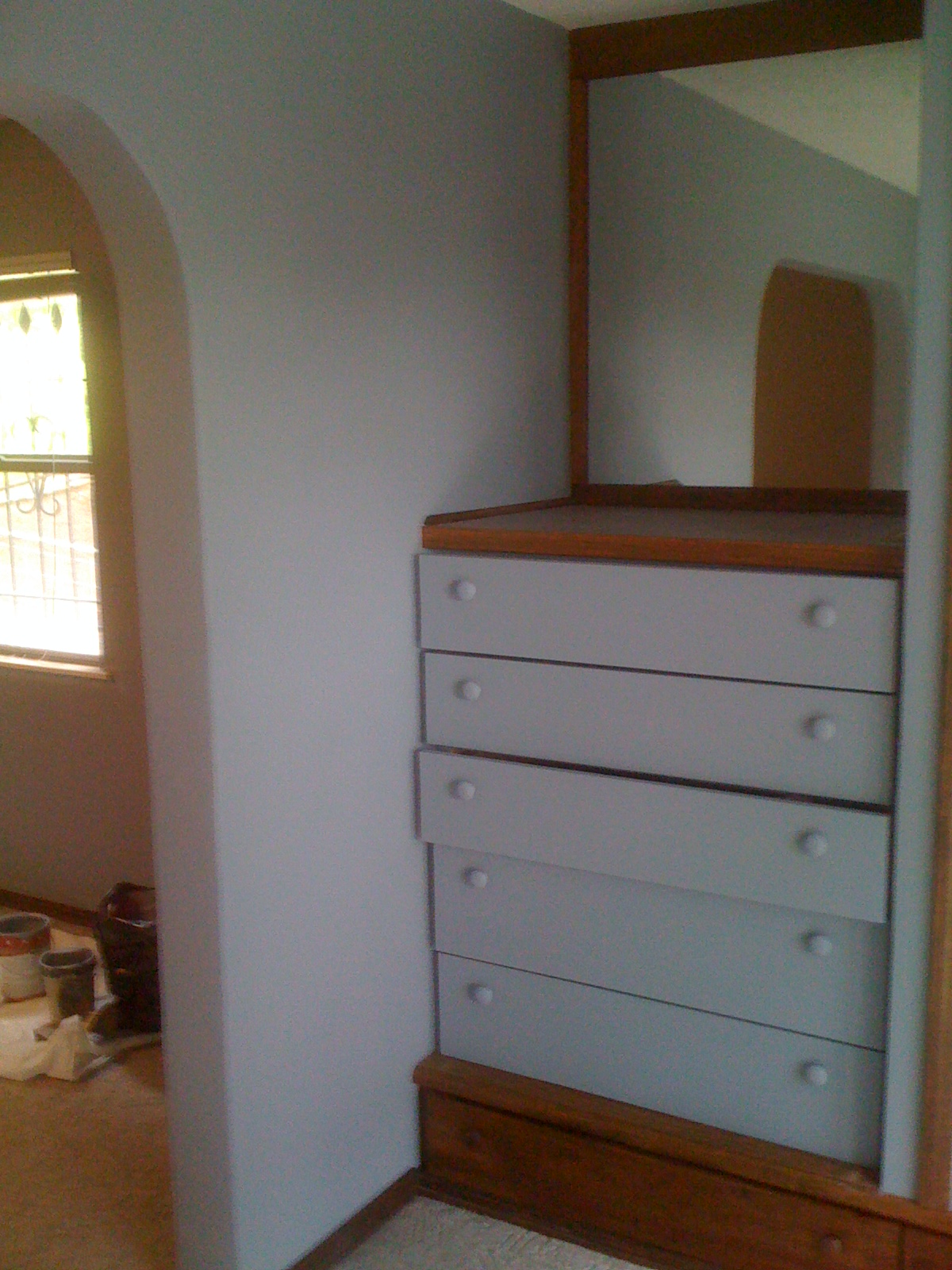
The master bath area naturally flows from the master suite and all of the doors and built in drawers were also painted as well as the exterior door that leads to a second floor balcony.

The colors are
Master Bedroom and bath—Gray
Guest Bedroom #1 –a very jazzy green
Guest Bedroom #2—Cream
Guest Bath—Peach


Each of these worked very well with the Orange that was painted in the main part of the house.  And the Tuscan theme was continued.  Each color was chosen to work with the décor of each area and in the case of the guest bath, the cabinets were already a peach color and the tile on the floor coordinated with the new color.

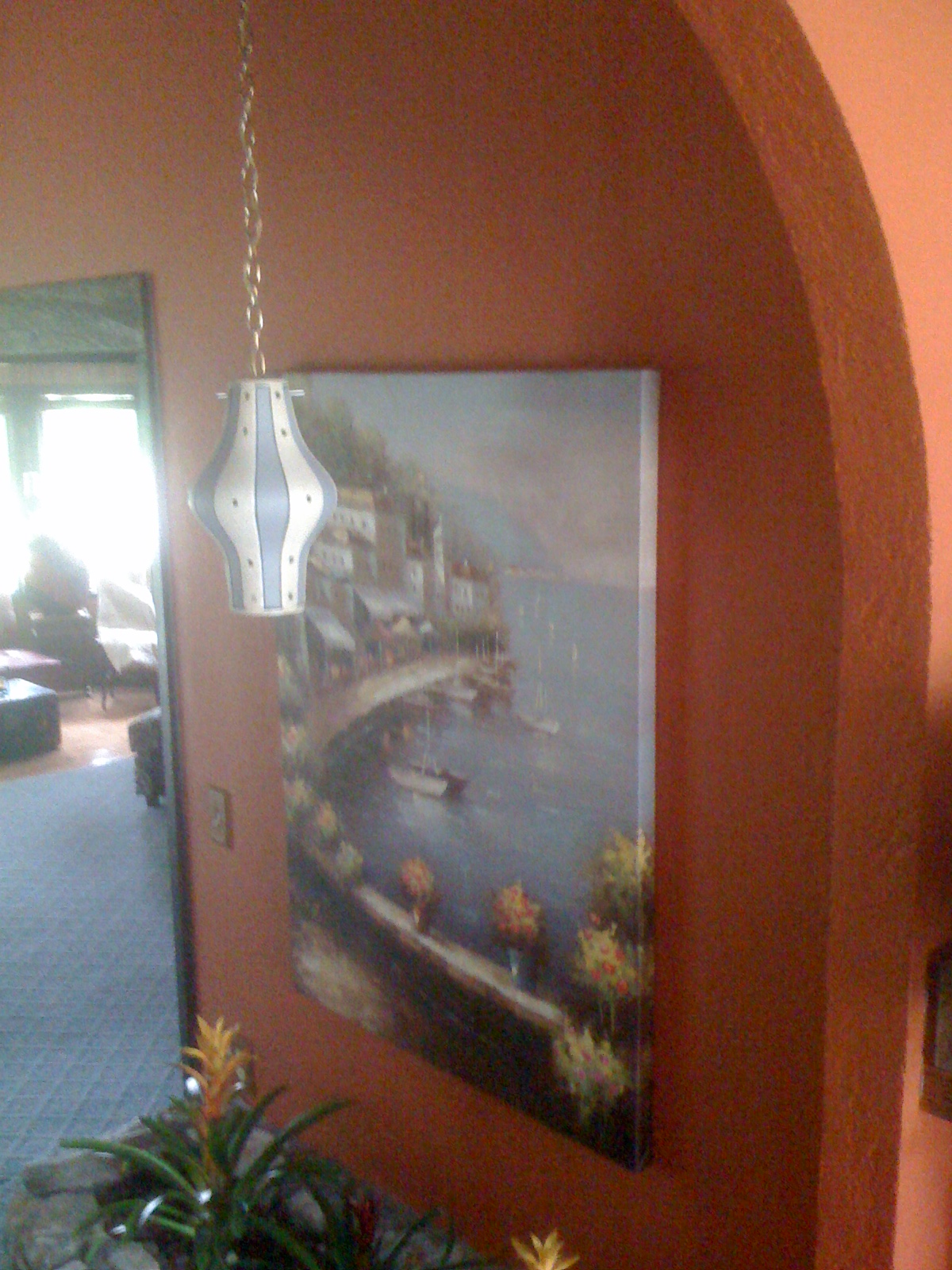
The Master suite is quite striking and the arch doorways and hand toweled texture on the walls certainly give it the Tuscan feel.

The portion of the home that was done first is now decorated and completed. Now that the rest of the house is painted it too will be decorated and the project brought to a completion.

Shelves were removed, doors taken down and mirrors were discarded.  And the stripping of the wallpaper in the guest bath turned into quite a job.  There was 2 layers of wallpaper and damage had been done to the walls and covered over with the wallpaper.  So, extensive repairs were needed to get the walls prepared for texture and paint.

We worked 12 days on this project and though it was hard work and a real challenge to keep it moving forward is was a real joy to be a part of the transformation of this house.  The owner was likewise wonderful to work for.  She was most gracious and was willing to vacate a portion of the house while we worked.  Most people have difficulty with tear-up in their homes.  And when someone is in your home for 3 weeks your routine and evening time is somewhat disturbed. 

Andrea, the home owner, commented on our first post of this project.  I mention this as a way to introduce her as the homeowner that I am talking about. 

Thank you for allowing us to work on your home.  Enjoy it to the full

As always “Happy Painting”
Ken Rader Interiors L.L.C.
Follow us and like us at www.facebook.com/Ken.Rader.Interiors