Thursday, May 31, 2012

Top Decorating Tips for you


Top Ways to Add Color to a Living Room

When it comes to home decorating, not everyone has either the time or the money to do a whole makeover in their living room. But don’t fret! You don’t have to spend a lot of either to get a nice change and pick-up to the look of your room. Read here for our 10 favorite ways to add color to your living room and liven up the décor of your home.

1. Paint One Wall

You will find that you can add a real punch of color by painting just one wall of your living room. This will really change the focal point of the living room without getting into a major decorating project. If your room has a niche, that’s the perfect choice for extra color. You can choose a bold, contrasting color picked from a floral fabric, or a subtle tone darker than the tone of the other walls. Any change in color will add interest and splash!

2. Throw a Few Pillows Around

Nothing adds color like pillows strategically placed on furniture. Whether you choose solids for a floral sofa or chair, or colorful, patterned pillows for a solid color chair or sofa, these simple additions will add comfort and just the right splash of color.

3. Add a Bit of Mother Nature (even if it means trying to fool her!)

Green plants or flowering ones add color, fragrance, personality, and just good feelings to the living room. If you really don’t have a green thumb, ask your nursery or home center to recommend ones that require little or no care. If you’re gone from home a lot, settle for some of the wonderful artificial ones on the market now. You can find great looking plants, foliage, and flowers that only need to be dusted.

4. Add a Whimsical Lamp

Even if you have a traditional classic living room, you can add a point of interest by selecting a lamp or shade that is colorful or whimsical. How about using an interesting pot or sculpture? You can have the electrical components installed for a reasonable price at a lamp shop. Then select a shade that’s an interesting shape, and glue trim of fringe, beads, or ribbon around the top and bottom to add color.

5. Put Some Color on the Floor

A colorful throw rug, strategically placed in front of a chair or under a coffee table can add color and texture to a living room. It can be put on top of hardwood flooring, painted floors, or carpet. You can choose a contrast color, chosen from fabric you’re using in the room, or look for one with an interesting pattern that will tie the theme of your room together.

6. Freshen Up a Chair Cushion

If you have a small chair, such as a desk chair or side chair, consider recovering the seat cushion. Fresh color on even this small area will offer interest and bring life to a dreary corner.

7. Reflecting Color

Try placing a large mirror on a bare, boring wall. Choose an interesting frame or decorate a piece of mirror with cording or braid. If you have an old frame, consider painting it a bright color. The mirror will reflect the color from around the room and add light to the space.

8. Get Artsy

A colorful piece of art placed in a living room not only adds a decorative touch, but also introduces colors and shapes you might not be able to use in a larger area. Try framing simple photos with colorful mats and bright frames.

These will give you a start on decorating your living room.  There is so much more.  Look at magazines, books, watch TV shows on decorating or look at some of my previous blogs.  Many have pictures of projects that we have completed.

Visit our site at http:www.kenraderinteriors.com
Visit and like our Facebook page at www.facebook.com/Ken.Rader.Interiors

As always, “Happy Painting”
Ken Rader
Ken Rader Interiors L.L.C.

Friday, May 25, 2012

COLOR THE WORLD YOUR WAY!


COLOR YOUR WORLD THE WAY YOU WANT IT

I love Color. Most people do. I get a kick out of changing the paint colors in a room, often. Or even my outfit colors get changed often, too. It’s just me! In realizing early on how color can set or change a mood, I have made it one of my life's goals to help as many people with color choices as is possible.

One thing I have learned is that color can be very personal. One person's favorite is another's person's dislike. And that can mean two people in a household not agreeing on a single color and can lead to a battle! I see this quite often when I'm doing a color consulting job. Does this sound familiar? It can be remedied, truly!

So, where does one start when deciding what color to use in a space? It’s not as difficult as you might think. You can use a color in a piece of artwork you love, or your cultural influences. Or there just may be a color that seems to speak to you saying, "Put me on the walls of a room in this house"! Did you know that a mood can be set with colors…like do you want the room to be romantic and cozy, sunny and bright, breezy and fun? Considering the activity in a room, if you want to create a space with loads of energy like a kitchen or family room or a more relaxing atmosphere like a bedroom, those moods can be set with color.

Visualizing the color on a wall can be very challenging. Actually as I am told by many customers, that simply selecting a paint color is one of the scariest things to try to do. It is unfortunate because adding paint color to a room is still the cheapest and quickest way to hide a multitude of mistakes or challenges. Here are a few things that the right paint color in a room can do:

**If you don't have a budget to furnish a room, color on the walls can help the room not to look so empty. It can add warmth and a sense of coziness.

**If your budget does not allow you to replace an old worn piece of furniture such as a sofa, a paint color that is similar to it can help blend it into the wall and not make it so noticeable.

**If you are thinking about remodeling a bathroom and your budget does not allow for replacing the tile, a paint color that coordinates with the tile color will treat it as less important in the room.

So, now that you have the basic idea, go out and get some good size swatches of the colors of paint you select and put it on the walls you want to paint. Live with that color(s) for a few days. Let the light of the morning change into the afternoon light and into evening. This is a very important step because natural and non natural light can change your perspective on that color. If you paint an area on the wall in that color, once it is actually painted it will still look somewhat different because you haven't used the proper primer yet. All of these steps can be taken in consideration.
Here are some colors I have used.


For those do-it-yourselfers out there, you can save both time and money by asking at the paint store what the right primer to use would be. This is especially important when you are using deep, dark or bright colors. A good professional painter will know how these colors will apply to the wall. They have worked with them time and time again. Using higher quality paints takes fewer coats and cover to hide flaws better then less expensive paints. Did you know that? Most aren't aware of it.   Bull Eye 1-2-3 , glidden Gripper, Kilz Premium will all serve you well.

Some of the paints I use during my consultations are Behr paints, Glidden paint and primer combination and Valspar. These paints are high quality, have wonderful color offerings and are easily available to any consumer.

Well, I hope I have helped a little. Take your time, this is a big decision. For more information, check out the www.kenraderinteriors.com  website for helpful hints. Or you can always check us out at www.facebook.com/ken.rader.interiors  for color consulting! We're happy to assist in your project! We have also written several blogs for your enjoyment in a wide variety of decorating and painting subjects.

As Always ‘Happy Painting

Monday, May 14, 2012

The Tuscan Villa Completed


A TUSCAN VILLA, THE RETURN

THE COMPLETED PROJECT

A couple of weeks ago I posted a project about painting the inside of a home to make it look like a Tuscan Villa.  The project was divided into 2 phases. This second post will talk about the bedrooms, bathrooms and the completed first phase.

There are 3 bedrooms and 2 bathrooms.  Each was given a different color.  The closets in each room were also painted to match the room and the ceilings were given a fresh coat of paint.

The guest bath needed to have the wallpaper removed and then have repairs done and texture applied to the walls before painting.

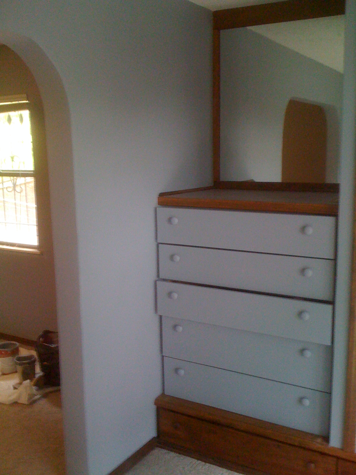
The master bath area naturally flows from the master suite and all of the doors and built in drawers were also painted as well as the exterior door that leads to a second floor balcony.

The colors are
Master Bedroom and bath—Gray
Guest Bedroom #1 –a very jazzy green
Guest Bedroom #2—Cream
Guest Bath—Peach


Each of these worked very well with the Orange that was painted in the main part of the house.  And the Tuscan theme was continued.  Each color was chosen to work with the décor of each area and in the case of the guest bath, the cabinets were already a peach color and the tile on the floor coordinated with the new color.

The Master suite is quite striking and the arch doorways and hand toweled texture on the walls certainly give it the Tuscan feel.

The portion of the home that was done first is now decorated and completed. Now that the rest of the house is painted it too will be decorated and the project brought to a completion.

Shelves were removed, doors taken down and mirrors were discarded.  And the stripping of the wallpaper in the guest bath turned into quite a job.  There was 2 layers of wallpaper and damage had been done to the walls and covered over with the wallpaper.  So, extensive repairs were needed to get the walls prepared for texture and paint.

We worked 12 days on this project and though it was hard work and a real challenge to keep it moving forward is was a real joy to be a part of the transformation of this house.  The owner was likewise wonderful to work for.  She was most gracious and was willing to vacate a portion of the house while we worked.  Most people have difficulty with tear-up in their homes.  And when someone is in your home for 3 weeks your routine and evening time is somewhat disturbed. 

Andrea, the home owner, commented on our first post of this project.  I mention this as a way to introduce her as the homeowner that I am talking about. 

Thank you for allowing us to work on your home.  Enjoy it to the full

As always “Happy Painting”
Ken Rader Interiors L.L.C.
Follow us and like us at www.facebook.com/Ken.Rader.Interiors

Friday, May 11, 2012

HAWAIIAN DECORATING, ARE YOU READY FOR SOME FUN?


The Hawaiian Decorating Style - Fun And Colorful

Decorative accessories are to your room decor what jewelry is to an outfit, and your Hawaiian decorating style is no exception. You should try to add to the fresh and inviting feel of Hawaii by using exotic island accessories. Adding accessories such as artwork, pillows and knick-knacks can help add interest your Hawaiian décor.
Wall art adds depth to any design, but you should learn how to hang it properly for the ideal impact. When displaying art, think like a gallery and keep the center of the piece at eye level. Try laying a grouping of artwork out on the floor first to get the best configuration. To compliment your Hawaiian decorating style, try decorating with floral prints in colorful frames.
Knick Knacks add charm as well as interest to your decorating approach. To compliment your Hawaiian home decorating, stick with accessories that have a fresh and inviting feeling. Adding palm tree and hula knick knacks on shelves and tables can produce a great look and so can an arrangement of hibiscus flowers in a vase. Spend time choosing appealing accessories which really reflect your personality. If you don't have lots of cash, you might try looking at the local flea markets and garage sales where you should be able to discover great accessories for little money.
Another decorative accessory you can display to add interest to your design theme is decorative pillows. You can have a use for pillows in most every room even the kitchen and bathroom. Pillows on the couch or chairs in your family room, den or living room will help inject a bit of the Hawaiian home decorating style. Stacking them in rows at your headboard can lend a professional appeal to your bedroom. Displaying pillows in the bathroom is one decorative touch a lot of folks don't think about but you can conveniently put one on the hamper or in shelves or racks with towels. Pillows which have colorful flower prints will help add appeal to your room style.
You could also accessorize with bamboo, light breezy fabrics, and plants to generate the style of Hawaii. To best benefit your room design, you should acquire accessories that not only match each other, but also the design theme. If you choose decorative items without much thought, then you can end up confusing the feeling you are attemptimg to develop.
Employing plants and colorful décor can add charm and interest to your Hawaiian decorating style. But before you go out and obtain a variety of things, you should get an idea of the kinds of things you want and stick to those pieces. You will need to be certain that your accessories are in the correct scale to each other so you need to be aware of the sizes of your items when picking them. Pick your items wisely and your design style is certain to look terrific!
Lee Dobbins writes for http://www.homedecoratingstuff.com where you can learn more about different decorating styles and get more information on Hawaiian decorating style.
Article Source: http://EzineArticles.com/?expert=Lee_Dobbins
Interior Decorators are a special breed of people.  Living in Arkansas I have not seen any of the Hawaiian décor.  I found this article and wanted share it.  Perhaps you had not thought about this style of décor.  I enjoyed reading the article and will use some of the advice in my decorating projects in the future.
As Always “Happy Painting”
Ken Rader Interiors L.L.C.
Follow us and like us at (www.facebook.com/ken.rader.interiors)

DECORATING TIPS FOR YOUR DREAM BEDROOM


Budget-Friendly Decorating Tips for your Bedroom

A LITTLE MONEY AND A LITTLE THOUGHT CAN GIVE YOU THE BEDROOM YOU WANT.


You can easily add some style to your bedroom without breaking the bank. Simply spruce up furniture with some wear and tear or add some inexpensive accent pieces for a whole new look and feel. 10 tips will do the trick for decorating your bedroom:
1. Hang framed art prints on your walls with,” Imagery of love” to create a beautiful bedroom sanctuary.
 Pictures of hearts, couples dancing or embracing are all choices that may help create the passionate energy every bedroom needs.  These usually come in an array of colors that will suite your wall colors.
2. If your bedroom furniture has seen better days, a coat of new paint or stain will spice it up. Paint your dressers, bed frames and nightstands a new color to bring them back to life.  A good coat of primer and the use of the new Paint and Primer products on the market will make this much easier.
3. Replace all the knobs on your dresser with something different to suit your style.  Though this can be fun, you will need to be very selective on the hardware that you choose.  Some of it is very expensive.  And if you will be using the new hardware for several years then get what you want.  Otherwise, watch the cost.  It can add up.
4. Bed frames can cost a pretty penny, so make your own with an easy home project. Simply cover a large piece of plywood with fabric of your choice for a sensational backdrop to be placed behind your bed.  Garage sales, Yard sales usually have bed frames that you can get really cheap.  The same is true about headboards and footboards.
5. Another alternative to purchasing a headboard is hanging a decorative curtain rod above your bed. Hang a beautiful blanket or a large piece of fabric on the curtain rod to create a unique wall piece.  A large piece of art will also serve the purpose.
6. Decorate in blues and greens to create a calm, peaceful bedroom that promotes sleep. Add a pop of red for more passion. Red pillow shams, decorative vases or framed artworks can add the right amount of this high-energy color.  Of course you will want to choose up to date colors.  All colors change in popularity.  Check the latest magazines for what is new and exciting.
7. The wall facing your bed is the focal wall .  Make it  "  Very pleasing and nice to think about.  This can be art or furniture.  If you use furniture make sure you do not clutter it up with stuff. That is not pleasant to look at.
8. There should be two of each of the accent pieces in your room to balance out your bedroom. Two lamps and two nightstands should do the trick. Search for nightstands on yard sales and cover them with pretty tableskirts to cover any flaws.  These do not have to match.  Part of the relaxing feeling comes from mismatched pieces.  Be sure and Make them functional as well. If you like to read then have a table and lamp that will serve your needs.  A single chair is also nice.
9. Add ribbon, lace or tassels to the pillowcases, pillow shams or comforters to jazz them up. This simple tip will create an air of elegance in your bedroom.  Jersey sheets are also a good choice in the winter, “always soft and warm”.
10. Create a focal point in your bedroom by decorating around it. Whether it's a picture you love, a gorgeous view or a fireplace, every room needs a focal point.  Many people will use a TV for the focal point. And while the prevailing advice is to leave the TV out of the bedroom, reality is “the TV is here to stay”.  So pick a nice one and be sure and have a DVD player so you can watch old movies instead of regular TV programs.  Having it on low volume can be just the trick to falling to sleep.
These are just a few tips.  I am sure you can add to them and make your bedroom your own.
As always “Happy Painting”
Ken Rader Interiors L.L.C.
Follow us and like us on Facebook  (www.facebook.com/Ken.Rader.Interiors )

Sunday, April 29, 2012

What should I paint my house with? Choices in sheen


Exterior Paint-“What should I choose?”

COLOR, TEXTURE AND SHEEN

Exterior paint offers a big array of color, texture and finishes. What to choose is time consuming and it can prove to be very difficult for homeowners to make the right choice.
SATIN PAINT: Satin finish exterior paint is a bit glossy but not too shiny either. If you want to give a subtle yet classy look to your home exteriors you can try using these paints. The best part of this finish is it suits wooden surfaces well, so you need not worry about painting the doors and windows with other paint finish. It is easy to clean and maintain walls painted with satin finished paints. Very durable, washable, fade resistant, will not chaulk. But you must use premium paint, NO CHEAP STUFF!
FLAT PAINT: This is the most popular choice among exterior paints. This paint typically does not have any sheen when applied to the walls and do not reflect light too. If your walls have minute flaws flat finish can conceal them in the best possible manner. Just make a smart color choice. These paints do not have shine so it is advisable not to coat your doors and windows with such finishes. Satin finish paints are a better choice for that purpose.
SEMI-GLOSS: This is about as glossy as you will want to go on the exterior of your home.  It works well on Doors, Shutters and sometimes big columns.  And this is usually the extent of gloss that is offered by most paint companies.  Some people use it on the garage door.  If you use an accent color in semi-gloss it can add life to your house.  But use it sparingly.  It will accent or make whatever you paint with it stand out so it needs to be something that you want to stand out.
All top quality exterior paints are washable and will not fade, so you do not need to worry about adding shine to extend the life of the paint.
Gloss finish paints: As the name suggest, gloss finish exterior paints have too much of shine element to them. This is a major reason why one should avoid using them heavily to paint exterior walls. This finish is ideal for painting door and windows. You can also use them to highlight something that you want visitors to call attention to. Wherever you want the eye to reach you can make use of this finish but do not to overuse this paint finish.
Textured finish paints: More textured paints which are excellent for exterior painting are offered now. You can choose from sprayed effect or the “do it yourself’ method of roller and or  brush effect, these can make a huge difference to the appearance of your home exteriors. If you are using subtle colors then textured paints are just right for you.  But I must warn you,’this is a lot of work’.  Hand rolling and brushing the exterior of a home is not easy. While there are always areas that require some brushing, the use of an airless sprayer is beyond belief.  It makes this project so much easier and the results are wonderful. Our homes are filled with textures and sheens on the inside but you can bring it in your exteriors too and make your home appear equally beautiful and unique on the outside.
I have written several articles and shared many from other authors on this subject.  You may be getting tired of reading on this matter.  However, I feel that choosing the right product for your project is the first and most important step towards a successful paint job.
Of course hiring the professional is in my humble opinion the best first step.  But if you are determined to do this yourself then spend some time to make the right choice at the start.  It does not cost any more to do it right but will usually cost you more if you do it wrong.  You know,’redo’.
I cannot over emphasize the importance of buying quality paint and primer.  A never before the difference between quality paint and the cheapest thing you can find is huge.  You can pay $100.00 for the paint and have to do it every year. Or you can pay $1000.00 for the paint and never ever have to paint again.  It is your choice.  “Im’, Just Say’n”
As always “ Happy Painting”
Ken Rader Interiors
www.kenraderinteriors.com
follow us at http://www.facebook.com/ken.rader.interiors
We are now listed on Angie’s list.

Friday, April 27, 2012


MAMAS’ COMING,”PAINT THE HOUSE WOW!”

The In Colors are Bright and Bold

I have been browsing through several magazines and noticed how bold and bright the color trends are.  Have You?  I was a teenager in the late 60’s and early 70’s and the popular colors then are back today.

Of course the names of the colors are different. Back then ‘Burnt Orange’, ‘Avocado, and Coppertone’. Those were BIG.  The colors now are ‘Monet Moonrise, Wythe Blue, Ice Breaker, Carrots.  But, “they are still bold and bright”.

The influence of Tuscan and Beach motifs’ are everywhere and in pretty much every décor. Greens, Blues and Oranges are offered in paints, accessories, furniture and well ‘you name it’.

That brings us to the subject at hand. Mama is coming “Paint the House WOW!”
We were contracted to paint the inside of a house that was originally built in the 1970’s.  It has been added too and changed somewhat but has a definite Tuscan flavor.

The new owner wanted to really bring the Tuscan décor to the forefront.  The interior really had the potential to accomplish this.  The openings between rooms were arches and the trim is massive and very dark.  There are beams on the ceiling in the great room and a wonderful patio out back with tile, rock and even some grape vines.  The walls in the various rooms are all hand trowel plaster.  Each room has a little different texture.  This is evidence of the different remodels and additions that were made to the house.  Each contractor had a different style.  This just adds to the Tuscan look that the homeowner wants to show off even more.


The ceilings needed to be painted so we started with them first.  The called for massive cover-up.  We have posted several pictures of this process.  This will give the do-it-your self group some idea of what is involved.  This is a very time consuming task when the people are living in the house while this is being done. We at Ken Rader Interiors L.L.C. are very conscious of the needs of people when we are in their home or shall I say “Villa”.

The floors in the Kitchen and Breakfast area are tile.  This too works well with the theme.

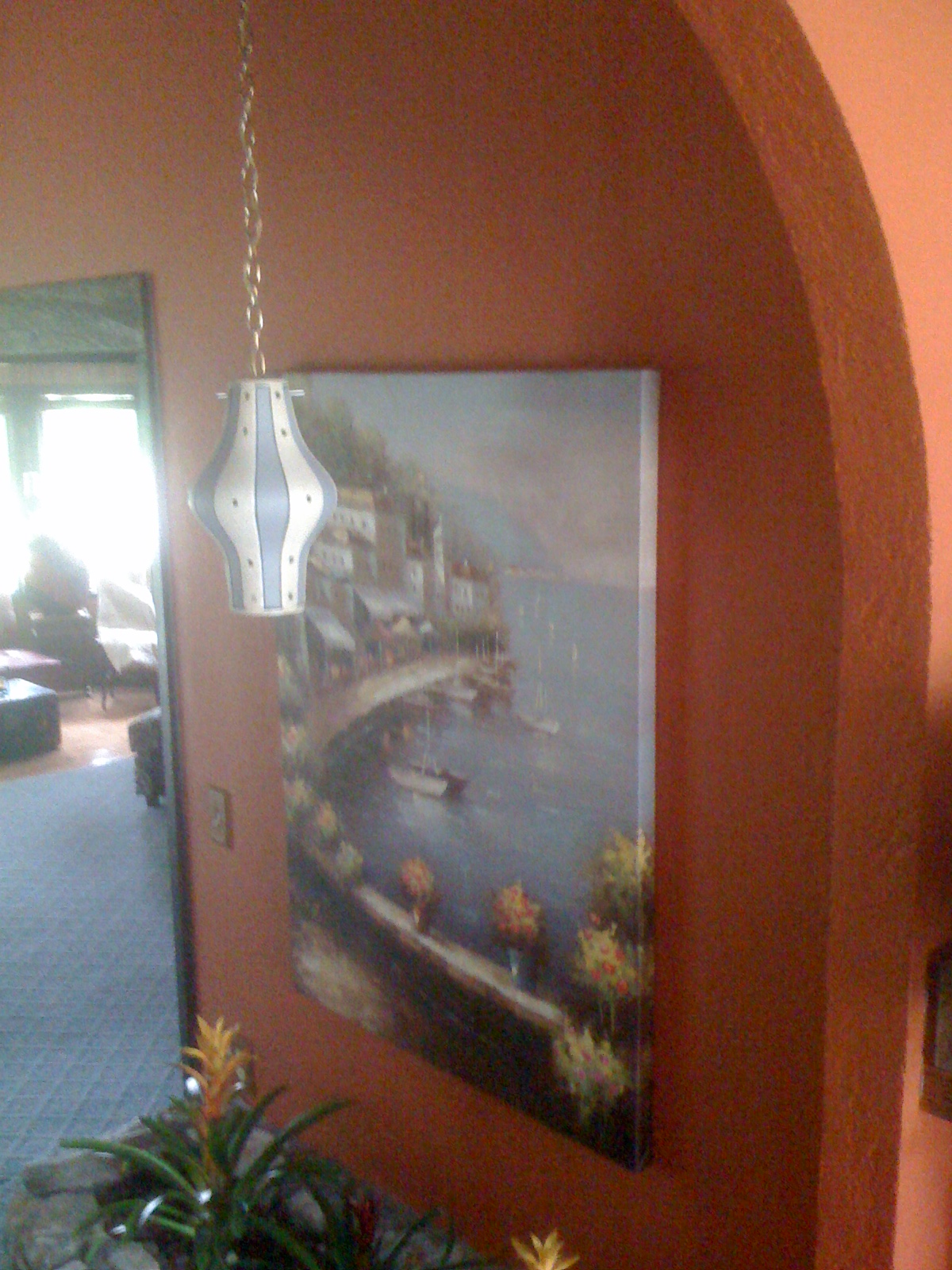
Next decision was the color for the walls.  Remember, the homeowner want WOW!  Her mother and sister are coming to visit and see the house for the first time and she wants to make a good impression.  The decorator has chosen “Bus Top Tour” from the ‘allen + roth’ collection.  It is orange.  Very bold and it takes your breath away.  I have to admit that I was a little worried about having so much of this color.  I could see accenting with it and having some accessories but not so thrilled with the idea of painting all of the walls.


Much thought went into picking this color and as I looked at the floors, furniture, trim and the pictures that would be used, I became more comfortable with the color.  So, “a painting we will go, a painting we will go’.  

Here are some pictures of the paint on the walls and a few of the finished project.  The heavy texture on the wall needed a lot of paint.  We used Behr primer and paint combo and were able to do the job with just 2 coats.  We were afraid it would take 3 or 4.

We definitely produced the WOW factor.  And the paint color is not over the top.  It is beautiful.  It is a success.

We were on a time limit to accomplish this project needing to get it done before the company arrives.  We painted the ceilings and walls of the Kitchen, dining room, hallway, entry, great room. Wet bar area and pantry in 3 days.  That’s right, three days, are we good or what?

My lovely wife is in some of these pictures, doing her thing, “attention to detail”.  I was doing the work too,’ I was just taking a few pictures’. 

We will be returning to this house in about 1 week to start painting 3 bedrooms, 2 baths and a laundry room.  The Tuscan theme will continue but with a different color.  We will keep you posted on the progress.

I learned a couple of things on this project.
1. Keep up to date with the colors people like
2. Other decorators have good ideas also.

If you are planning a new paint job for your home be sure and check out some of the newest magazines for ideas of color and theme.

As always “Happy Painting”
Ken Rader Interiors L.L.C.
Follow us at http://www.facebook.com/ken.rader.interiors